
I like how the 'candy' has been used to make up the lettering and the colours that have gone into the design. I think it is very eye catching and makes the text look exciting.

I like how the text is made to look like part of the picture in this one. However, I don't think this would work in my article.

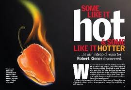
I like how the text has been put together. It is all different sizes, yet fits together really well.

I like the different coloured bands in this piece. i think it makes the article look really attractive and appealing to the eye. This could work in my piece. I could turn them into beware of the dog banners, although that might put people off slightly!
again, in this article, I like the colours that have been used and the way that the text fits together. some of the words being different colours makes the article more exciting to read and gives the words more meaning.
I think that the use of colour psychology will make my article much more fun to read, like using the colour red for hot objects, or blue for cold etc.
No comments:
Post a Comment