Straight away I can see a difference between the Vogue and Reveal covers. An enlarged image as the background and various pieces of text make the cover look much more sophisticated.
I like how they have set these pages out and incorporated images in with the text and almost created a border. They have also used larger, different styles of font to make the title and subtitles stand out. I also like how they have split the text so it is in different areas of the page.
I like how they have taken the photograph on this one, so that some of the image is in the background, but the image also has text in it. As my article is based around a building and not a person, I dont think this theme would fit in with my article, but I could have a large image to one side of the page and my text on the other. I also like how they have enlarged the first letter of the first paragraph, I could try using this somewhere in my article. These pages are much more organised than the Reveal articles, but I think the larger letter may look better with a messy looking page :)
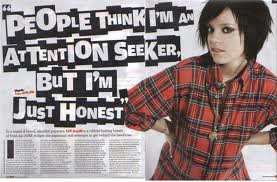
I like the title on this page. They have crated it from something she has said, but I like how all the letters are different sizes and the white colouring stands out against the black background. Again, in this article, they have enlarged the first letter of the first paragraph. I also like the layout, a large title, a block of text and a large image to the side. Plain and simple.


No comments:
Post a Comment