Thursday, 12 January 2012
Photo Merging
These are the photos that I took of Zoey with the hoop. I was hoping to merge them together. The 1st 2 images merged together reasonably well, but you could still see where they had been merged, as the bottom of the hoop didn't match exactly, which meant that you could see a slight overlap. The third picture was way to small which meant that the camera had been moved too much. The hoop was too small and was no where near big enough. This photo was a complete fail, as the camera had been moved too much, which meant the images didnt overlap like they should.
Tuesday, 10 January 2012
Vogue Magazine
Straight away I can see a difference between the Vogue and Reveal covers. An enlarged image as the background and various pieces of text make the cover look much more sophisticated.
I like how they have set these pages out and incorporated images in with the text and almost created a border. They have also used larger, different styles of font to make the title and subtitles stand out. I also like how they have split the text so it is in different areas of the page.
I like how they have taken the photograph on this one, so that some of the image is in the background, but the image also has text in it. As my article is based around a building and not a person, I dont think this theme would fit in with my article, but I could have a large image to one side of the page and my text on the other. I also like how they have enlarged the first letter of the first paragraph, I could try using this somewhere in my article. These pages are much more organised than the Reveal articles, but I think the larger letter may look better with a messy looking page :)
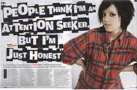
I like the title on this page. They have crated it from something she has said, but I like how all the letters are different sizes and the white colouring stands out against the black background. Again, in this article, they have enlarged the first letter of the first paragraph. I also like the layout, a large title, a block of text and a large image to the side. Plain and simple.
Reveal Magazine
Reveal magazine is aimed at a younger, teenage audience. It is described as a celebrity gossip magazine.
Most articles in this magazine are set out the same. They have a large title, a large photo, often with a few smaller ones and then a large block of text. In some of the articles, they take quotes, or sections of the text and enlarge them, change the colour of them and the text to make them stand out more.
I like how the front covers are always full of different things. It makes the front cover very eye catching and appealing.
I like the layout of these pages. I think it makes the page more appealing and exciting to look at.
Casper Edit
I edited my previous photo of casper turning it to a black and white photo and then burning the edges using the shadow tool to block out the images and other shapes in the background, making him seem a lot whiter and the image brighter. I like this photo and think I might experiment with making some of my other photos black and white.
a view of the yard
This is the yard that joins the 2 blocks of kennels together
This is Buster, who doesn't look too happy with his new coat!
Casper!
Lexi!
couldn't get her to sit still!
Wednesday, 4 January 2012
More SNOW!
MORE SNOW!
I like that there are lots of trees around the kennels and think it encourages wildlife. I may include this somewhere in my article.
I like how you can see the snow falling in the photo. This was taken just as it was starting. I like it even though it isn't really of anything, like a spare of the moment photo :)
I like how you can see a lot f the area in this photo. i would like to put this photo in my work.
More of the snow falling from the sky. We have a resident peacock and that is his fave place to sit!
More of the pond. I will have to choose between the photos i have got.
The field looks very wintery. I could base my article around a winter/christmassy theme, as an article to promote the kennels for the festive season to potential customers.
The play pen.
SNOW! SNOW! SNOW!
SNOW! SNOW! SNOW!
The entrance looks rather pretty in the snow. I think this would look good at the opening of my article.
The pond looks great in the snow because of all the different shapes. I think this photo would look good as possibly a background or a merging photo in my article.
The trees that cover the path are so thick hardy any of the snow came through! i like this picture, the way the trees look like obstacles, but if i was to put this in my article, i would need to do something with it.
I really like these photos and would love to include them somewhere. I would probably edit them a little as the quality isn't really that great.
I like how you can see the snowdrops falling in this photo!
More to come!
Subscribe to:
Posts (Atom)