Tuesday, 24 January 2012

PEACOCK!


I would like to add a photo of the peacock in as i love his colours.  I think they would look even better if i could brighten the colours! 

Monday, 16 January 2012

Colour Psycology

Colour Psychology Basics

Here are some of the most frequently used colors and the positive messages they communicate. As noted, this basic chart isn't comprehensive. It doesn't list negative associations and it doesn't discuss the best ways to combine colors. However, it is an interesting introduction to colour psychology. When we work our logo design magic, we bring even more to the table.

BLACK: Mystery, secrecy, tradition.
BLUE: Power, calmness, success, trustworthiness.
BROWN: Earth and nature, simplicity, seriousness.
GREEN: Harmony, health and healing, nature and animals, money.
ORANGE: Affordability, fun, youth, creativity, celebration.
PURPLE: Fantasy and dreams, justice, royalty.
RED: Excitement, action, adventure, love, passion, food.
WHITE: Simplicity, cleanliness, innocence.
YELLOW: Cheerfulness, playfulness, curiosity, amusement.

RAINBOW: Brings joy


http://www.logodesignteam.com/logo-design-color-psychology.html

A Few More Typography Examples

I like how the 'candy' has been used to make up the lettering and the colours that have gone into the design.  I think it is very eye catching and makes the text look exciting.


I like how the text is made to look like part of the picture in this one.  However, I don't think this would work in my article.

I like how the text has been put together.  It is all different sizes, yet fits together really well.

I like the different coloured bands in this piece.  i think  it makes the article look really attractive and appealing to the eye.  This could work in my piece.  I could turn them into beware of the dog banners, although that might put people off slightly!


again, in this article, I like the colours that have been used and the way that the text fits together.  some of the words being different colours makes the article more exciting to read and gives the words more meaning.  
I think that the use of colour psychology will make my article much more fun to read, like using the colour red for hot objects, or blue for cold etc. 

examples of typography

Being a 'beginner' in this class, i actually had to research what typography meant first.  I found a few examples on one website which could be relevant and relate to my magazine article.


These are all animal related images.  I think it would be quite interesting to experiment with this idea and turn my image into a dog or a cat?

http://www.pics24h.com/minimalist-typography-examples/

More magazine covers

This time I decided to look at an animal magazine, as this is what I will be creating.  I think this is more like the vogue layout, made to appeal to the older, more sophisticated audience.  It has a very basic layout, and enlarged title and bits of text around the edges to give the viewer and idea on what is in the magazine, without them having to flick through.  The enlarged photograph in the background makes it appealing to the customer.


I also looked at a childrens magazine to compare the difference.  It still had the same enlarged title and enlarged photograph in the background, but there is a lot less text on the cover.  There are more photos to replace the text and there is also an animal cartoon charecter, so that the child can relate to the animal.  I also noticed that they used a photo of a cub as the background image, not a fully grown animal.  This could also be something to do with the target audience being younger. 


I think the basic layout will probably be the best layout for my magazine article, but my article will target the older audience, so there will be a little more text than photos on my cover.

Photo Merging: Pencil Vs. Camera

These images were created by a photographer called Ben Heine.  He is described as a creative painter, illustrator, portraitist, caricaturist and photographer who has a very simplistic but singular style and his work is very fresh and original.  I found him whilst browsing the internet and have fallen in love with his work.  I think I could use this style in my work and it would be very effective.  My only worry is, looking at previous magazine spreads, I have never seen a photograph like this.  They are generally all plain, straight forward photographs.  I'm going to have a go myself and see how it turns out, SO WATCH THIS SPACE!

I really like this image.  I think its really clever how the image almost looks like it has been drawn to scale.  He had drawn in a section of the tree that fit perfectly, and even the tram lines match up. 

I like how he has included a little bit of comedy in with this photo. 

This drawing doesn't match up exactly, but  it still looks great!


I like this photo, in fact, this one is my faveourite.  I thought if I could get a dog to sit in the play pen, with a bit of grass and tree in the background, then I could try and recreate this image in a similar sort of way and think it would fit in perfectly with the theme of my article. 


I thought this was another image I could try and re create.  This photo of the donkeys has been taken outside some stables, so I thought I could take my photo outside of, or inside one of the kennels, and could then make the photo more humorous by drawing a comical face on the dog, or cat.

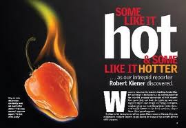
I cannot be trusted with fire! This one is a definate NO GO!

A sea of volunteers? Could be change to a sea of dogs?


I like how he has included colour within his illustration in this image.

I love this one and think it is very clever, but have no idea how I could include something like this in my photo or how I could get a photograph of a mountain!


I like how this one has been turned into a game :)

I like how he has made a hole in the drawing to show some of the photo, and how it all works so well.


Photo Manipulation


Whilst browsing the internet, I came across this spanish photographer.  His name is Ramiro Salazar.  The photos you can see above, he created for a company called BIRM.  I like the way they have been done and think it is very clever how it has been reversed.  The image with the brick and the light bulb is my faveourite.  He has also done work for companies such as El Comercio, Tame Ecuador Airlines, Chevrolet, and various others.  Each of the companies he has produced images for are completely different and have been done in many different styles.  I like his work, but don't think it would work in my article as I wasn't planning on smashing anything up!